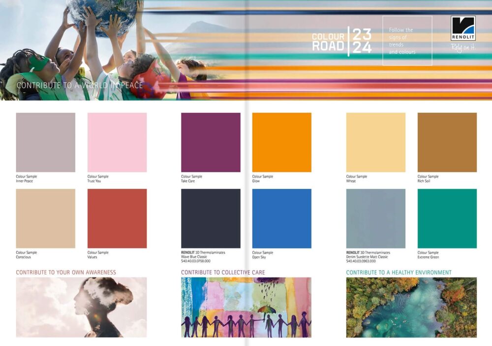
Trendservice Colour Road from RENOLIT
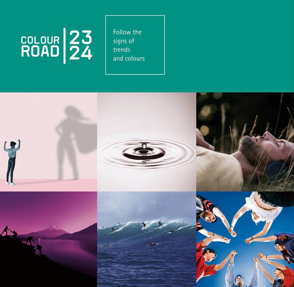
This is the next edition of the guide developed by RENOLIT specialists. According to the authors, its task is to show and follow the colour trends 23/24 for the interior design industry. The guide refers to global trends and changes, it is created in close cooperation with trend research institutes and experts in the field.
Colour Road gives manufacturers of furniture, flooring, doors, wall panels and caravans inspirational tips on which colours and materials will be fashionable, explain RENOLIT experts. – Colours come from visually powerful images that open worlds of inspiration for interior product designers.
In the compilation for 2022/23, the authors of the guide focused on various dimensions of human life. They made an attempt to combine it with nature, the cosmos, and the digital world – our new reality, which is more and more present in our everyday life. This year’s edition emphasizes the richness of our inner, human world and how it can affect the environment we live in. Therefore, for the Colour Road 2023/23 guide, its authors have chosen the slogan: CONTRIBUTION TO WORLD PEACE. The key word here is “contribution”, indicating that in order to see changes in the world, we must take an active stance and start the changes with ourselves.
Read also: Colour Road 2022/23. A guide to colour and design trends from RENOLIT
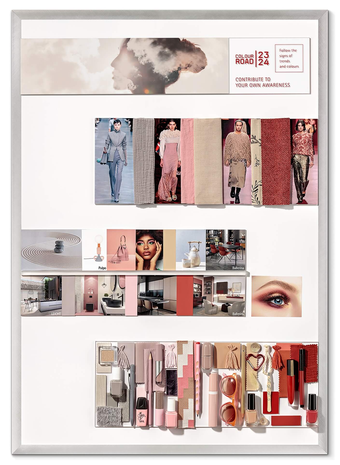
Contribute to your awareness
This is the first tip that the authors of the guide give. As they explain:
Uncertainty and change have become our companions. It’s a challenge to keep your balance and find your own satisfaction. Only those who are at peace with themselves, aware of themselves and their strengths, can meet others in the same way.
Calming and natural support for developing self-awareness is to be provided by soft and discreet neutral colours. Warm grey INNER PEACE creates a sense of harmonious peace and supports contemplation. CONSCIOUS, referring to natural beige, is to draw attention to the conscious use of our own resources, but also of nature and society. TRUST YOU is an accent colour. Pastel, but expressive pink encourages you to use the available energy to create something good. The palette is complemented by a deep shade of mineral red VALUES, which is supposed to go straight to the heart and embody strength and recognition. This emotional red invites you to reflect on your own values and attitudes, reaching both the mind and the body.
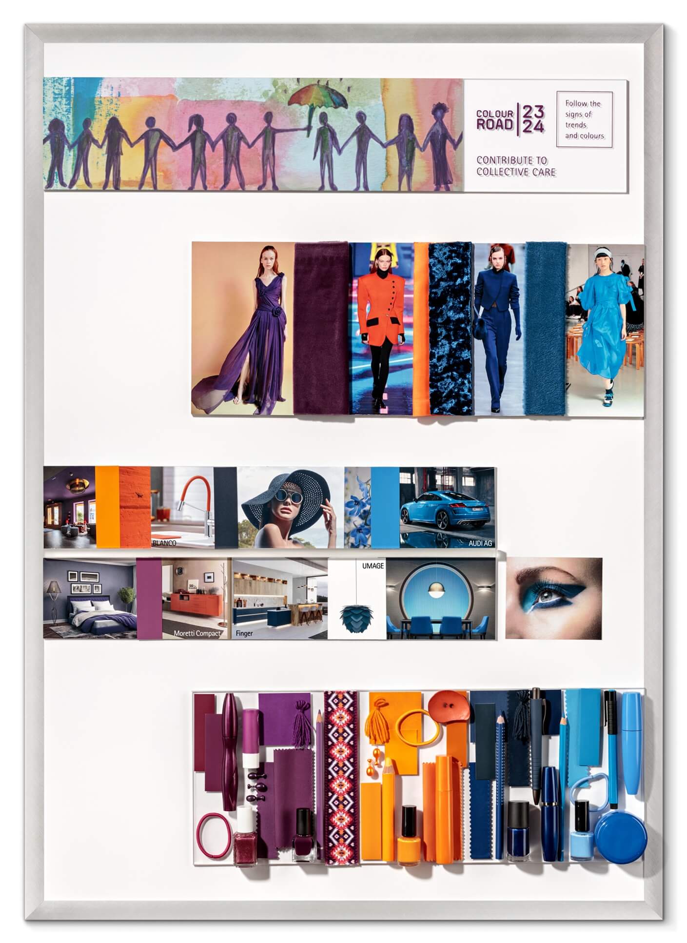
Contribute to collective care
Another aspect of our everyday life is collective care, which the authors of the guide put above individualism:
Individuality and self-expression have strongly shaped our Western society. Old traditions, like the ancient African philosophy of life, Ubuntu, take on new, important meanings. “I am because you are” is the idea of living in natural and spiritual dependence. It can show us alternative ways of living in connection with each other. We livened up this way of thinking with bold, cheerful and energetic colours.
The first colour in this palette, TAKE CARE, calls for the idea of care. The expressive violet strengthens concentration and awareness and is balanced by the warm, intense orange GLOW, which in its shade refers to a spectacular sunset. This shade not only stimulates creativity but also makes what we bring to the world of ours and others shine with a beautiful glow. On the opposite side of this palette is WAVE BLUE CLASSIC, a very deep and dynamic garnet that provides a good basis for combining vibes and effective relationships. It is supported by OPEN SKY, a modern, fresh blue with high intensity and perfect balance. It represents an open mind that knows no boundaries, where different thoughts from different sources can recombine to create surprising results.
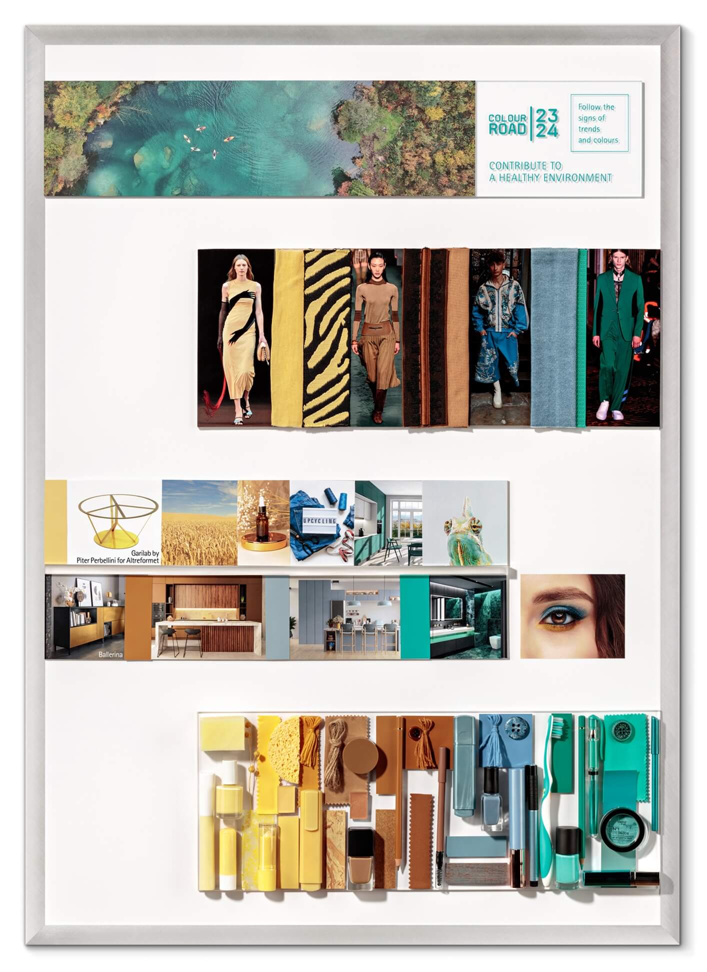
Contribute to a healthy environment
The idea of caring for a healthy environment also returns, but this time the message is much stronger:
Crises teach us that we cannot live as we used to and that we must fundamentally change our attitudes and behaviours to preserve our planet and our future. We have chosen this truth as the starting point for our third theme, which deals with aspects of a better and healthier environment.
The palette begins with a soft, muted WHEAT yellow that evokes the image of endless wheat fields and reminds us of the challenge of providing enough staple food for an ever-growing world population. DENIM SUEDETTE MATT CLASSIC, a pale blue shade with elements reminiscent of black, refers to denim fashion and calls for new environmentally friendly and recyclable production processes. The earthy, warm brown of RICH SOIL symbolizes a growing awareness of the value of our soils, their vulnerability and protection. The whole palette is complemented by EXTREME GREEN, a bold combination of green and blue. It evokes an emerald chameleon, reminding us of the adaptability we need for sustainable forms of mobility, urban development and living.
Contact
Do you have questions? Contact us.
We will be pleased to answer all questions about MELACO’s offer, terms of cooperation and orders. Write or call us.
Contact
Melaco sp. z o.o.
ul. Ciepielowska 9
67-100 Nowa Sól
Poland
SALES DEPARTMENT
Agata Sroczyńska
Sales Coordinator
SALES DEPARTMENT
Beata Prałat
Sales Specialist
